A stable image shell with aspect ratio, fit, rounding, and empty state.
Media defines how EnterUI handles a stable image shell with aspect ratio, fit, rounding, and empty state, including default structure, accessible states, and token-driven styling.
Media prevents image layout shift in cards and previews.

<Grid min={180} gap={16}>
  <Media src="/enterui-logo-square.png" alt="EnterUI mark" aspectRatio={1} />
  <Media alt="Empty media placeholder" aspectRatio={1} />
</Grid>import { Media } from "@froggdesign/enter-ui-react";Media defaults to aspectRatio={16 / 9}, fit="cover", and rounded corners.
Cover can crop a logo. For standalone logos use fit="contain" with the asset's
aspect ratio. HeaderBrand provides a 180×60px contained logo frame through
component styling; no page CSS is required.
Media forwards image props to the inner img. Provide meaningful alt text for informative images and empty alt text for decorative images.
src and alt describe the image.aspectRatio defaults to 16 / 9.fit: cover or contain.rounded toggles the default radius.Uses .eui-media classes and neutral token surfaces.
Use variant="illustration" for transparent artwork without a surrounding image
surface or border. motion="float" plays one gentle four-second entrance and
returns to rest. It never loops and is disabled by prefers-reduced-motion.
motion="none" and variant="default" remain the defaults.
A contained image with a short float entrance and reduced-motion support.
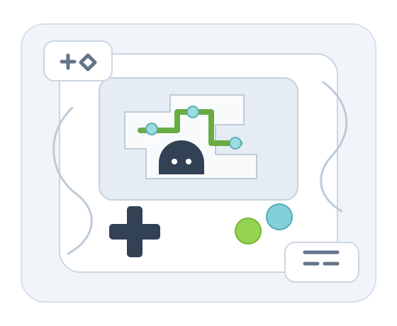
<Media
  src="/enter-ui/assets/arcade.svg"
  alt="A handheld console with a maze and character"
  aspectRatio={560 / 460}
  fit="contain"
  variant="illustration"
  motion="float"
/>
The aspect ratio reserves space at every viewport width. Animation affects only
the image, so nearby content does not move. Media is non-interactive and creates
no keyboard stop; decorative images should use alt="".
Media automatically shows a lightweight landscape illustration while an image loads. A drifting cloud and softly glowing sun animate only during loading; missing or failed images keep a static landscape instead of an empty gray box. The illustration is inline SVG and requires no additional image request.
Use placeholder="static" to disable loading animation. The default is
placeholder="animated"; reduced-motion preferences always disable animation.
The image keeps its reserved aspect ratio and original alt text. onLoad and
onError callbacks are forwarded. Changing src starts the loading state again.
<Media src="/travel/bali.jpg" alt="Bali coastline" placeholder="animated" />
<Media alt="Photo unavailable" placeholder="static" />